13 examples of dark patterns in ecommerce checkouts
 By Ben Davis, April 6th, 2017
(also available at https://econsultancy.com/13-examples-of-dark-patterns-in-ecommerce-checkouts/, accessed on 2022-05-25)
Dark patterns are deceptive parts of a digital user interface, designed to trick the user into making a decision that benefits the business involved.
Darkpatterns.org is a terrific website conceived by Harry Brignull as part of a campaign to raise awareness of dark patterns. The site includes a roundup of the most common categories of dark patterns, as well as a hall of shame with examples submitted by the UX community.
I thought I would select some examples of dark patterns found in ecommerce checkouts to highlight the issue. Most of the examples are taken from the #darkpatterns hashtag on Twitter.
Misdirection
Where the website design nudges users towards a more expensive option and distracts them from the standard option.
Misdirection is the sneakiest type of dark pattern because it exists in a grey area. This sort of tactic is commonplace because it is harder to outlaw, as opposed to the ‘sneak into basket’ tactic (discussed further down the article), which is outlawed in the EU.
The example from Delta, shown below, uses a red button to nudge checking-in users towards an upgrade. A must less conspicuous grey button must be selected to say ‘no thanks’ and continue checking in.
Econsultancy blogger Paul Randall has previously highlighted an even sneakier example of misdirection from ZSL London Zoo.
In the screenshot below you can see how the ‘add to basket with donation’ green button appears to suggest moving forward to the next stage of the checkout. The colourless ‘without donation’ button points backward, leaving the unobservant user to assume this is some sort of back arrow to return to a previous page.

Misdirection is probably most commonly found on email unsubscribe interfaces. When a user has clicked to unsubscribe, it is obviously devious to highlight the ‘keep my subscription‘ option over the actual intention of the user (to unsubscribe).
@lootcrate Making “Keep my subscription” an orange button on a page where I’m cancelling is deceptive and in poor taste. #darkpattern pic.twitter.com/7E2Kb80d1y
— Aaron Benjamin (@aBenjamin765) February 11, 2017
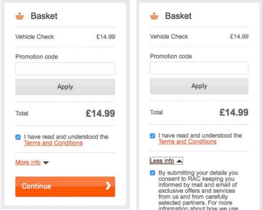
Checkbox treachery
Obfuscatory checkboxes are probably the most famous and most common examples of dark patterns. What we’re mainly talking about is opt-in or opt-out checkboxes and accompanying spiel that businesses use to give customers notional control over how their contact data is used.
Whilst in the US the CAN-SPAM Act does not restrict how businesses can collect new subscribers (i.e. they do not need to gain prior consent), in the EU consumers must be offered an opt-out option.
In practice though, these mandatory opt-out options can be a little confusing, or even downright sly. Below is a heinous mobile example provided by Ben Tollady and Gareth Roberts at UX New Zealand.
Of course, another common dark pattern amongst checkboxes is double negatives – language that makes the user unsure whether to tick or to untick. Here’s a great example…
Or in the example below, a seeming call-to-action next to the checkbox (‘keeping in touch’) which is at odds with the functionality of the checkbox (‘keeping in touch’ is merely a heading). Not cool…
@virginmedia This is called a #UX #DarkPattern & is rather unethical in it’s design and possibly illegal. Not cool
https://t.co/sbuHsOcVbg pic.twitter.com/DAFs20hFOJ— Joelle Bataille (@Joelle_Bataille) March 21, 2017
Lastly, here’s a more subtle example of a dark pattern – what appears to be a radio is in fact a checkbox. One might argue this is a genuine mistake – it’s certainly one to look out for on your own website.
It’s pretty simple, if you’ve decided to give the user the option (as is necessary in Europe), you should provide an opt in (not an opt out) with clear supporting text.
Sneak into basket
This is another classic. It is usually performed by offering a supplementary service or product to a user, who is made to actively unselect this extra product otherwise it will appear in the checkout.
The worst transgressors here are in the travel sector. Ryanair still forces customers to deselect an insurance product when adding a flight to basket, despite the fact that this tactic is illegal according to the EU’s consumer rights laws.

Image via Digital Tonic’s Ryanair website review.
Sports Direct is another high profile abuser of this dark pattern. In the past a ‘free’ mug and Sports Direct magazine (£1 delivery charge) have been added to customer baskets online, without any notification.
Though the retailer has now added a pop-up offering the ‘free’ mug to users, note how inconspicuous the ‘no thanks’ text is compared to the large white ‘yes please’ button.
Obscured pricing
Yet another travel example here. British Airways does not tell bookers what price they will have to pay to add a bag to the hold after they have booked their ticket, merely stating ‘for a fee’. Nor does it tell the price of seat selection or booking amendments.
The obvious intention here is not to undermine the price of the £31 upgrade from ‘basic’ to ‘plus’.
It’s not just obscured pricing that can be a problem. Darkpatterns.org highlights how Sainsbury’s website does not allow comparison of all of its groceries, instead displaying some prices per weight and some per unit. This makes it hard for users to understand which product is cheapest.
Misinformation / terrible language
I can’t work out if this example is intentional or not. I hope not. But again it highlights the need to look at all your functional ecommerce copy and determine if it is as clear as it could be.
Hidden costs
In the EU, all extra charges such as shipping must be highlighted (at least the fact that they exist and will be applied) before the customer gets to the checkout.
A good example of hidden costs provided by darkpatterns.org is on the US flower delivery website ProFlowers.
The ethics of CRO
So, that’s the end of my roundup of examples. Please do check out Paul Randall’s post on the ethics of conversion rate optimisation – there is a way to optimise without misleading the customer.
And do share any dark patterns you see on your travels by using the #darkpatterns hashtag.
For more advice on UI design, subscribers can download the User Experience and Interaction Design for Mobile & Web Best Practice Guide.
Questions
- What are dark patterns? Use your own words in your definition.
-
List three categories of dark patterns (misdirection is one) along with an example of each of the categories that you list. For each example, please provide the unethical scenario from the article along with a description of how the designer of the scenario is trying to deceive the user.
Category 1:
Example:
Category 2:
Example:
Category 3:
Example:
Dark patterns appear to be unethical. But how might someone support this claim? We will look at the ethicality of dark patterns using three ethical frameworks. If you have not explored these three frameworks previously, summaries are included.
Summary of Ethical Frameworks
Virtue ethics (as opposed to deontology and utilitarianism) is an ethical decision-making framework derived from the moral values that a society has in common. Examples of moral values (also called virtues) might include compassion, courage, generosity, gratitude, honesty, humility, inclusion, integrity, justice, mercy, open-mindedness, perseverance, respect, and transparency, but there are many others. An activity might be considered unethical it if conflicts with one or more of a society’s virtues.
Deontological ethics determines whether something is right or wrong based on adherence to certain moral principles such as traffic laws, a company’s code of ethics, or The Ten Commandments. In a government context, this set of principles might be the US Constitution or the UN Charter of Human Rights. The primary computing organization (the ACM) has its own code of ethics as do many business, scientific, and medical organizations. A well-known principal from the American Medical Association is “Do no harm”. Another deontological principle could be “Give credit where it is due.”
Using the ethical framework of utilitarianism, the ethics of a situation is decided by whether a particular course of action will benefit the most people. For example, vaccinations are considered to be the ethical choice by most in our society because they protect the general population (the majority stakeholder) from spread of disease.
-
Choose one scenario that you listed above, and explain how it would conflict with a virtue. You may use a virtue already listed, or choose another one that is important to you.
-
Write a principle that you believe would be broken if an e-commerce site was designed using one of the dark patterns you listed above? (2)
-
Make a statement about the ethics of dark patterns from a utilitarian point of view. Who benefits from the dark patterns? Who suffers? Should they be used (are they ethical)?
-
Go to an E-Commerce site that you use and look for an example of the use of a dark pattern. Send a screenshot of this example to your professor along with an explanation of why you believe this page is misleading enough to be unethical. (6 points)